Tuesday, September 21, 2010

Scorecard / Dashboard poor design

Stay away from “Chart Junk”
        Chart junk refers to visual content that serves no analytical purpose.  It’s just there for decoration.  Your customers will quickly tire of this content (as it is typically static) and this space on the scorecard will quickly become useless.  If you try to use this space at a later date for some important data your customers will have to retrain themselves to look at that space.  The space is better left blank.
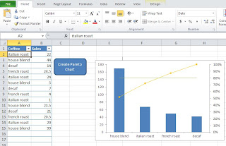
Example of "Chart Junk"


Monday, September 20, 2010

Pareto Chart template

I've been gone a while working on a new template.  This one is will allow you to import or enter data into an excel spreadsheet and create a pareto chart.  I also wrote an article about how/when to use a pareto chart

Simply enter (or import) data into columns A and B.  A should be your data to group by and B should be the values.  No need to sum the data prior to importing it.  The tool will do that for you.  Please check it out.  Let me know if you find it useful.